01
A photo with a point of view
Choose one clear subject with natural light and room around the face or body. A sharp phone photo is useful; a crowded screenshot usually is not.
Start with a player, a memory, or one excellent idea. Player Originals turns it into three distinct visual directions so you can compare before choosing what belongs on the paddle.
The free studio reads a practice brief locally, recommends a starting direction, and personalizes curated examples. Uploads, AI generation, accounts, and ordering stay off.
You do not need to arrive with finished artwork. A few specific, meaningful inputs give the concept enough character without making it visually noisy.
01
Choose one clear subject with natural light and room around the face or body. A sharp phone photo is useful; a crowded screenshot usually is not.
02
A nickname, jersey number, home court, meaningful year, or two-color palette makes the concept personal without covering it in text.
03
Words like quiet, fearless, precise, sun-faded, or match-day energy give the studio better creative boundaries than a long list of visual effects.
A personalized paddle does not need every possible detail. Choose one visual anchor, one supporting detail, and a clear mood. Editing is what keeps it feeling designed.
Useful rule: if removing an element makes the story clearer, leave it out.
Use one recognizable subject as the visual anchor. The composition can feel personal without adding a name at all.
Keep spelling exact and decide whether the text should lead the design or reward a closer look.
One specific detail usually carries more meaning than a list of dates, slogans, and statistics competing for attention.
Choose colors the player actually uses, then describe the feeling: cinematic, expressive, understated, sun-faded, or something more specific.
Make three creative decisions. We will recommend the strongest starting direction, explain the tradeoffs, and hand you a practical build plan—not a random template.
Your recommended direction
The player should stay recognizable at first glance. This direction gives one strong photo the lead, then uses type and color to frame the person instead of competing with them. Keep the treatment human: preserve recognition, natural detail, and enough restraint for the person or meaning to read first.
Build it in this order
Opens a free local-only example preview. No upload, account, card, or production order is created.
Most custom-product sites let a weak upload become tomorrow's disappointing print. Start with a fast, private readiness check and know what still needs human review.
This private browser check reads only the file dimensions and size. The image is not uploaded, stored, or used to train anything.
This is an early screen, not a production guarantee. We will review the actual composition and supplier proof separately.
What this catches
Tiny screenshots, compressed downloads, and crop-risk aspect ratios—before they become a frustrating design brief.
Start with the visual language that feels most like the player. Names, numbers, and story details are layered in after the direction is chosen.
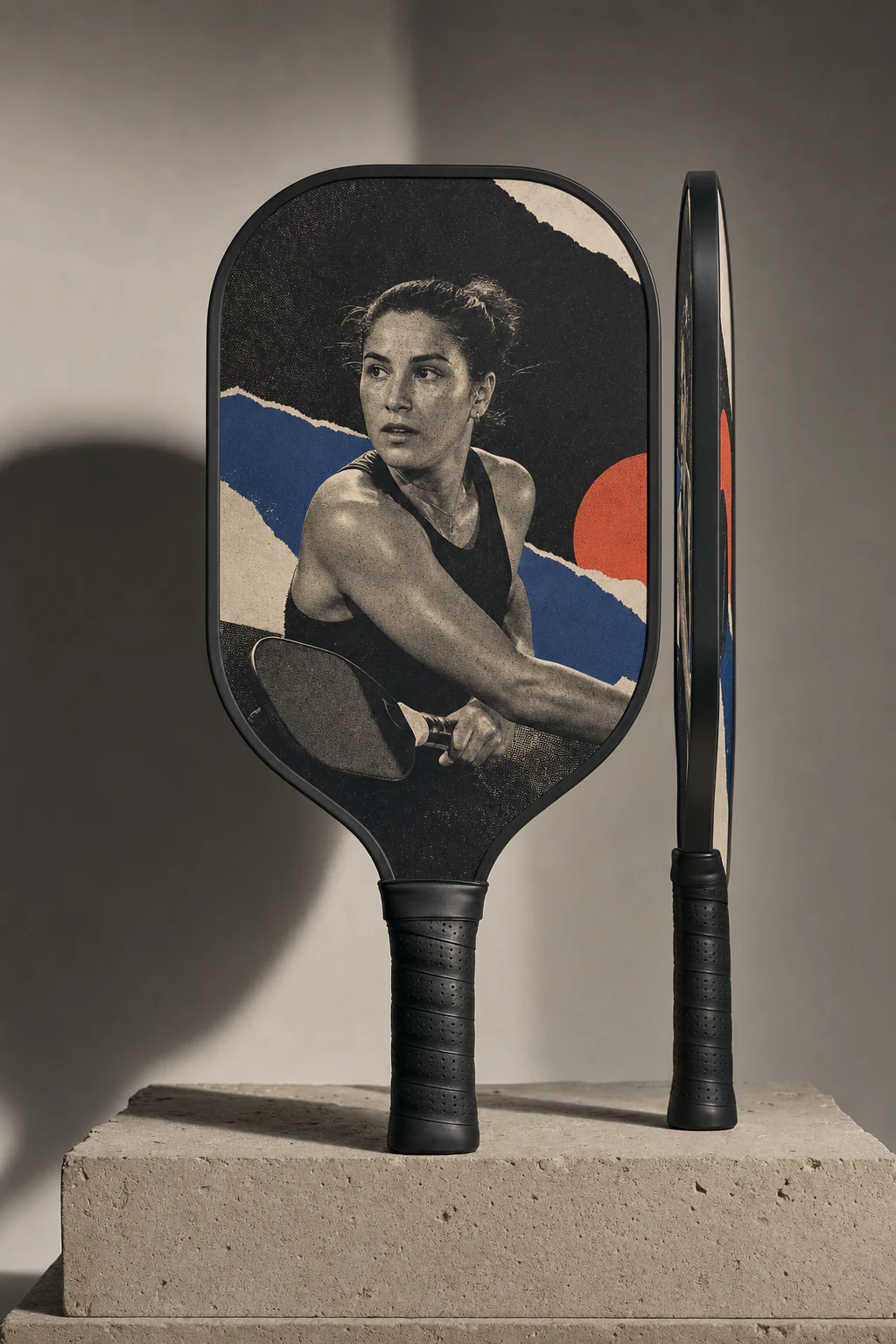
A tactile portrait treatment with torn-paper composition and restrained color.
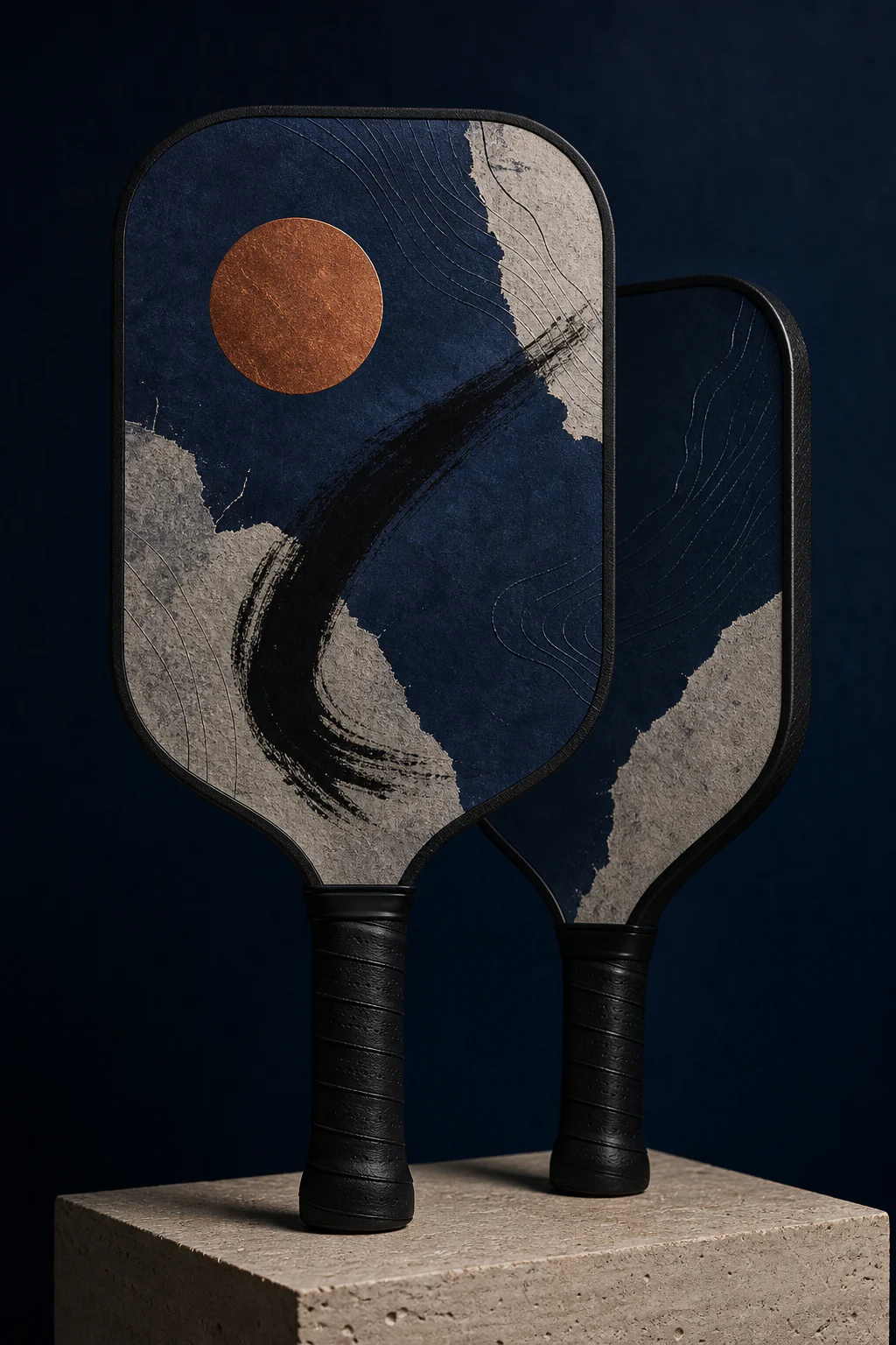
Indigo, bone, and copper shaped by black brushwork and topographic contours.
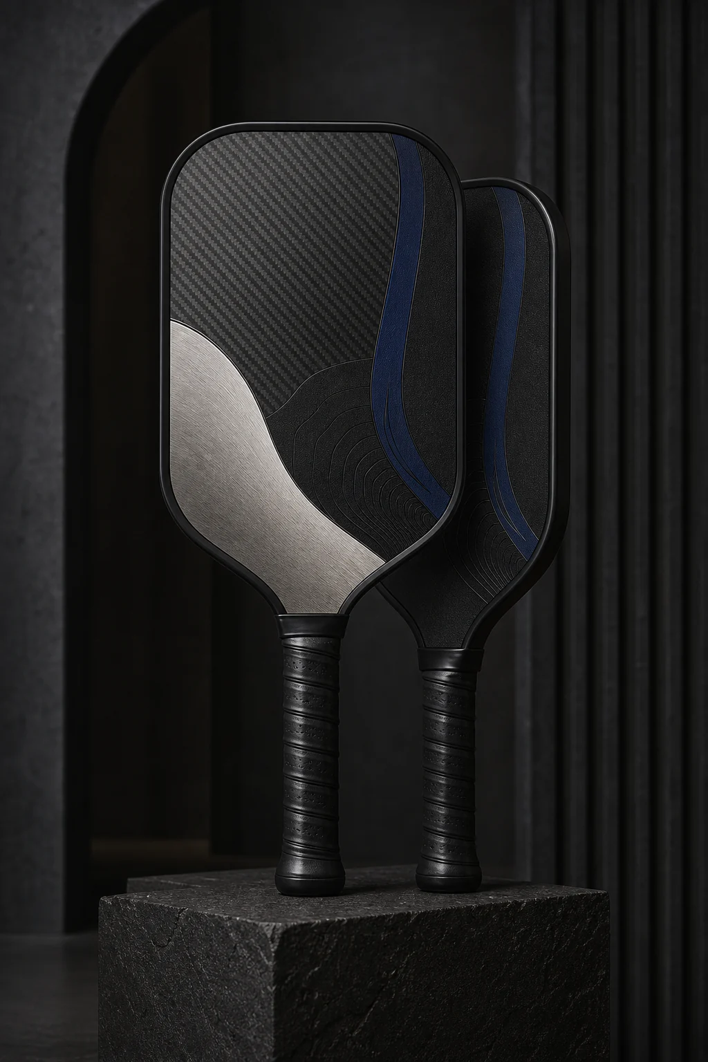
Obsidian black, platinum gray, and ultramarine in a precise tonal study.
Do not force a portrait into every custom pickleball paddle. Match the creative direction to the strongest source material and the player's actual taste.
Best when
You have one strong photo and want the player to be immediately recognizable.
Watch for
Busy backgrounds, cropped limbs, screenshots, or a face too close to the image edge.
Best when
The color, movement, place, or emotion matters more than a literal portrait.
Watch for
Too many references. Pick one memory and a tight palette so the story still reads.
Best when
The player prefers restrained gear and a name, date, or symbol can carry the meaning.
Watch for
Tiny details or low contrast that may look elegant on screen but still need a physical print check.
The studio separates the big creative choice from the small personalization choices. First choose the overall direction. Then refine the name, number, and story details that make it unmistakably yours.
Free preview
Is the overall idea, direction, and personalization worth developing?
Artwork review
Are the spelling, crop, contrast, and hierarchy ready for a production decision?
Physical sample gate
Do the printed color, fine detail, edge crop, paddle, and packaging meet the bar?
Build a free preview with no card and no production order. You can explore the creative experience while our physical quality testing is underway.
Open the free preview studio